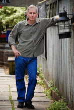
I’m taking a page from the Keith Raffel playbook of photo selection: Let the masses decide!
Here are some headshots. Which do you think is the best?**
After the pose is selected, then I’ll get busy on Photoshop!
(In case you missed it, I don’t like saying cheese.)
Footnotes
*No, these are not the Four Stooges
**Okay, I’ll settle for “least frightening.”


10 comments:
Very funny, Alan. Hanging out with Steven Spielberg again, eh? I like them all, actually, but the upper right hand corner is my favorite.
I'm with Lisa--they're all good, but the upper right is by far the best.
Elizabeth
Either upper right or lower left. I can't decide.
Bottom left -- Shows more nuiance and character in your face.
Now is this photo for your new book, Choirs I Have Sung In? Or is it for crime fiction. How about some grit? Maybe you can add some wrinkles and whiskers with Photoshop.
Thanks for your comments, they are all appreciated.
And Keith, the bad new is: These are my grittiest poses!
Hi, there ... not frightening at all, Alan. I choose the upper right Maybe you can take some of the "texture'' out of the backdrop with Photoshop, as newspapers/mags prefer a smooth background ... but if not, no worries, cuz the one with the brownish backg. is good, too.
As for grit ... Keith has enough of that going for all of us! :-)
Upper or lower left. Upper left is slightly more mysterious. Depends on what you're aiming for, tone-wise, no?
I vote for bottom left. I think you look slightly uncomfortable in the first two (like me in all photos) and more natural in the bottom one.
I like bottom left, too. Is it being used for something exciting?
Post a Comment