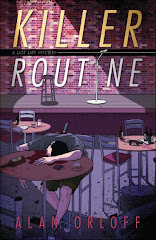
Regular visitors to this blog may notice that, every once in a while, some new widget or geegaw or doohickey appears on the blog's sidebar (what can I say, I like shiny things). Each one--on its own--is fine; I'm not too sure about the aesthetic of the entire mass (or should it be mess?).
Usually, I care more about what's inside the package than the wrapping. But in a world that's getting more "virtual" every day, I want my on-line presence to be pleasant, not jarring or disconnected. So that's why I tinker. It’s also why I'm never sure whether I'm making things better or worse.
Same holds true for my website, although I don't fiddle around there nearly as often as with my blog. In the next few months, I’ve "resigned myself to redesign." Now that I know how to use Photoshop (at least a little), I'm sure it will be a piece of cake. Ahem. (If it’s a problem, I’ll just get Galen’s help.)
I already have a partial list of things I want to include/improve. Some will be relatively easy, others will probably have to wait until one of my kids gets his college degree in Computer Science. Of course, maybe by then, the Internet will have been superseded by direct data pipelines straight into people's brains. (Google NeuroNet?)
Anyway, I'm looking for ideas about how to improve the look (and the content, too) of both my blog and my website.
All suggestions welcome! Just remember: complete demolition is NOT an option.


9 comments:
Well, you know how decorative my own blog is (Not!)
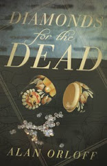
I'd like to see your back cover copy for "Diamonds"---until your great reviews come in (and they'll come, I know). Then you could switch out the cover copy for the reviews.
Elizabeth
Mystery Writing is Murder
Alan,
I know *exactly* what you mean about tinkering with a blog. I agree completely that a blog shouldn't be jarring. What I like about yours is that it's not too cluttered. I also like the nice balance you have between promoting your writing (as you should), and "shoving it in the reader's face." Some blogs I've seen are just too self-aggrandizing.
One thing I included on my blog, for what it's worth, is a search widget. That way, people can look for references to my own writing, or they can look for names of authors I mention, etc..
Yes, Alan, if you want all your hard work destroyed, turn to the indigent and non-trained…that would be me. I can blow up a blog faster than anyone while trying to “improve” it. Let’s see, I’ve done that at least twice, maybe three times to mine. The upside, is, I’ve gotten pretty good at reassembly.
I like the look and feel of your blog. Good, soothing colors, good organization with the important stuff up top where it can’t be missed. Couple small thoughts.
--Seems like you’ve gone to a MWF schedule. Good. Might want to post that info near the top n a sidebar, or a sticky post. Blog hoppers are a fast moving bunch and probably appreciate knowing they don’t need to drop by on TT. If you’re not gonna be here. Not all use Google reader or some kind of consolidator.
--Twitter is pretty powerful. Might want to move your Follow Me gadget further up the page. The theory, I think, is that the further down the page things are, the less likely they are to be noticed. Dunno if that’s true, but I try to observe it anyway. (Doing things without understanding is a sign of the truly clueless.) By the way….somehow, I was NOT following your blog on Facebook. Sorry. That was an oversight and I correct it just now.
Lastly there’s a little java script email button on my website that makes it easy for my many, many, many, many fans to just pour the emails to me. (Never received one.) Anyway, you actually DO have fans, so, an Email Me button to an account built especially for that might be handy.
As to the web site. Again, clean, easy to navigate. I like it. In terms of content, who knows what should be there? You might want to run over to mine and see if there’s anything there you could adopt…Press Kit, comes to mind (Though mine is still not done.) Reviews maybe? Sample chapters? Lots of things you can do, it’s just a question of do you. There you are, Pal. Sorry to be so long-winded.
Best Regards, Galen
P.S. Have you considered selling books yourself using the web and blog. I’ve post…or used to if it wasn’t destroyed in one of my improvements about that and how it’s way more money than waiting for Amazon to rip you off. It was reprinted, with permission, from Wildfire Marketing and is no doubt still on their blog.
Imagineering Fiction Blog
I am computer-challenged. For proof of this fact, look at my blog! I admire anyone for tinkering with their blog or website as I would be terrified of blowing up the world. I had my twitter feed on my blog, and now I need to get it back. How do I do this???
I've been no help at all; but perhaps I've made you feel superior, which is never a bad thing.
Elspeth
Elizabeth - I'd like to see my back cover copy, too :)
Margot - A search widget--that's a good idea.
Galen - Some great ideas (but I wouldn't expect less from you). An email doohickey - I like that. Then I can get spam from a whole new group of people.
Elspeth - For the record, I do not feel superior, computer- or other-wise. Especially not after wasting about 30 minutes trying to get an envelope printed this morning (finally had to go with labels-arg!)
Okay, I'm totally stealing some of Galen's ideas. An email button. Hmm. I think I need one of those.
I just grabbed my back cover text off the MI website. Looks like yours is already up: http://www.midnightinkbooks.com/product.php?ean=9780738719481
Elizabeth
Thanks, Elizabeth. I've seen that (put it on my bookmarks, in fact). I just didn't realize that would be going on my back cover. What can I say? I'm new at this.
I wouldn't have known either, except I noticed that their product description ended up on Amazon for pre-order and then went onto the back of my books. Ahh...communication. :)
I see your blue background on the left and right as empty wasted space. If You cannot do anything with this space, try a new layout that is one solid background yet still allows two or three columns to place your blogs and all the shiny shiny bright colors and blinking lights.
Post a Comment