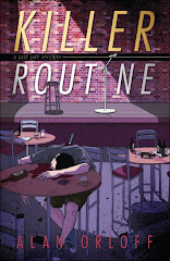
Now that I’ve completed a draft of my WIP and it’s out being read by my crack critiquers, I can spend some time on other things. This week’s project: designing a bookmark to promote KILLER ROUTINE.
Over the years, I’ve been collecting bookmarks from other writers, to steal ideas draw inspiration from.
Many elements are included on these bookmarks:
- Book description
- Author bio
- Author picture
- Book cover art
- Bibliography of other books
- Contact info, including web addresses, blogs, mailing lists, emails
- Publishing info (publisher, ISBN, release date)
- Blurbs and reviews
- Awards won
What to include? What to leave out? There’s only so much space, you know.
Any advice? What information/graphics do you like to see on a writer’s bookmark?


6 comments:
Alan - I think bookmarks really are important, but they should have visual impact more than be chock-full of dizzying amounts of info. I think the most effective ones have the title of the new release, maybe a sentence describing it, and author website and contact info. That plus a butt-kicking graphic.
Book cover, pithy teaser, author name, contact info, ISBN, I think. Starts looking a little busy after that. With a clear book cover, you don't even have to put the title or author name on the bookmark.
Since I use mine as both teasers and business cards when appropriate, I find that the book cover and very short tag line on the front, and the book blurb on the back seem to be the best "selling" tool.
And of course, your name and website URL. I used to put the ISBN, but that was before I realized they were different for every format, and my books started with digital ISBNs, then got new ones for the print editions.
(If anyone is interested in a $25 discount code for Printing For Less, the company that's done all mine, and has EXCELLENT customer service, drop me an email - terry at terryodell dot com.)
Terry
Terry's Place
Romance with a Twist--of Mystery
I want to see the book cover, either a teeny synopsis or a couple of review quotes, and definitely the author's website and blog.
Patricia
Margot - I am graphically/artistically challenged. Good thing my cover is "butt-kicking."
Elizabeth - You'll probably hate my bookmark. Too many words, I think.
Terry - I really like my printer: printplace.com. Great prices and great quality.
Patricia - I think I should make up my own review quotes: "Orloff is a writer like no other," or "I thoroughly read this book."
Add a blurb. Like "Read my brother.--Erica Orloff"
Post a Comment