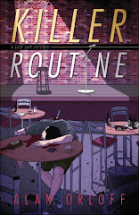
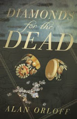
Last week, I mentioned my bookmark project. Here’s what I’ve come up with, front and back. (The actual, printed PDF images seem a little crisper than these on-screen. Also, these images include some bleed room, ie, the margins on the real bookmarks won’t be as large.)
I know, many of you think I’ve included too many words. However, when someone asks me what my book’s about, I can just hand them a bookmark, rather than go through the spiel myself. And I’m all for talking as little as possible.
Anyway, comments?


9 comments:
They're beautiful! Simple, elegant, says it all. Way to go!
I also like the quote from Publisher's Weekly. Nice.
Alan - These are terrific! Thanks for sharing. You're motivating me to get my own finished! And I don't think they're too wordy. I really don't.
I don't think it's too many words.
They look great! There is a lot of text but they are going to do what you want them too - save you words in person. Plus, they got me interested in the books. So I'd call them a success!
I love the design, but I am in the "too many words" camp. I guess I come from the "elevator speech" school of thought - find a way to explain your book in 25 words or less/15 seconds or less. Anything longer than that and you might lose your audience's attention, regardless of whether it's spoken or written...
And I have one suggestion (even though it adds even more words!): I'd put your website on the front of the bookmark.
I definitely like the idea of adding a blurb to the markers. They look good and having the blurb does save you some work.
Piedmont - Thanks! I was going for simple and elegant :) (well, at least simple)
Margot - Get busy, girl!
Lynn - Okay. That's one person interested, 9,999 to go.
Ingrid - I can't hear you! Nanananananaananannana. Just kidding. Thanks for your input.
Joy - It's okay that I made up the blurbs, isn't it? :)
I like it! I'm going to show it to my husband, who designed my last bookmarks, as an example to use in designing the new one.
The bookmark looks great. But you have such a great blog, Alan. Can't you squeeze in your blog url, even if you have to take out another line somewhere?
Patricia
Post a Comment