In case you didn’t see this post yesterday on InkSpot, here it is on my very own personal blog.
Sometimes when I’m giving a book talk, I’ll ask the audience what drives them to purchase a book. Is it the title? The cover copy? The reviews? The terrific things they’ve heard about the witty and charming author standing before them? (Hmm, I don’t get very many positive responses to that one.)
Usually, I’ll get a variety of answers—after all, different people are moved by different things—but for some reason, not everyone admits that a book’s cover is a factor.
Of course, I know they’re lying.
Covers are huge. Covers catch the eye and draw a reader in. Covers entice, set the mood, tantalize the reader with great intrigue. That old saying, “You can’t judge a book by its cover”? Utter hogwash.
Sure, if a reader likes a particular author, the cover may not matter so much. And the cover might not matter if your BFF demands you read a book because it was the best book ever. But if you’re on the fence about a book, then how you feel about the cover is definitely part of the equation.
That’s why publishers hire talented cover designers. That’s why there’s so much emphasis placed on designing the perfect cover for each book. Why do you think publishers have wonderful, slick, glossy catalogs? To display their wonderful, slick, glossy covers!!!
I’m still relatively new in the publishing business, but I have learned one thing: My publisher, Midnight Ink, designs the best covers in the business.
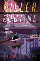
Not that you need it, but here’s some more evidence. I present to you the cover for KILLER ROUTINE:
Awesome!!!
Thanks Midnight Ink.
Okay, here are the discussion questions for today. Will the rise of the ebook lessen the importance of a good cover? Will covers have to change in the ebook era? How?


10 comments:
Very eye catching cover.
Mason
Thoughts in Progress
Great cover! Whoever designed it earned his or her pay.
Very nice, Alan. This one will definitely catch some eyes!
Another winner -- excellent cover, and very eye-catching.
Very nice! The art department did it again, Alan. I think cover art will always be important, even if you're viewing it online.
Hearth Cricket
I find it arresting.
Seriously, it's very graphic-novel-like. This is not a bad thing.
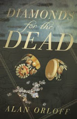
Thanks everyone! It sure is a lot different than the last one (which I loved, too, btw).
What a great cover! Love the colors, and the use of shadows.
I think covers will have to change in the e-book era. They'll have to "pop" more, and they'll probably have to have fewer details (I'm thinking of them having to be eye-catching in a thumbnail size on Amazon and other e-book sites, rather than catching your eye on a bookstore display).
I hate to admit it, Alan, but I frequently buy books because of their great covers. You should be very happy with yours.
That cover is indeed awesome!
And you are right that covers catch your eyes. I rarely *buy* books based on covers, though. I buy books recommended by trusted blog friends (but perhaps that is just me - I know I am stingy, or perhaps it is just because I know I can only spend my book budget once).
Post a Comment